Monday 30 June 2014

EXP 3 FINAL SUBMISSION


Animations


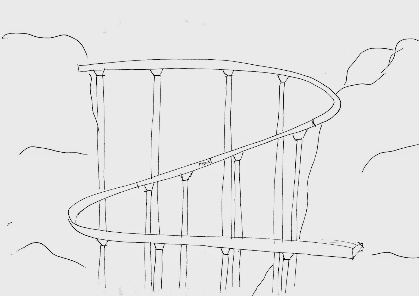
This moving element connects the lower and the upper valley, which will mostly be used by students from the lecture to the library or other places. The monorail provides view towards the surrounding environment, ranging from the overall view of the landscape and the nearby buildings.

The monorail is slanted as it favours the uneven environment. It engages with the concept of having a connection with the landscape.


This lift connects the upper valley with the architectural folly that is placed on the highest point of the environment. The use of circles as the main shape show connections with the buildings around the area. This moving element will show the vast snowy landscape with the bird eye view of the buildings down the landscape.


Dropbox link

SketchUp Model link

Marking Sheet


Changes for Final Design

The idea of using a ramp as the bridge is approved by my tutor, however the buildings are not well-thought so I did some brainstorming about buildings which have curves as their main structures.


The ramp conveys the theory knowledge-driven architecture; about designing buildings which will suit comfortably with the environment. Different heights of the hills are then matched with the ramp, so the buildings can sit comfortably on top of the ground. 


Final design of the ramp, with the added support structures to the bridge. It added more depth and more thought on how it will be built in real life.


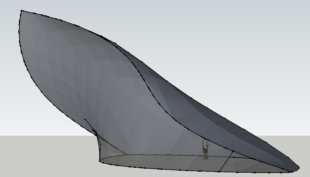
I decided to design 3 buildings with curves (similar to the bridges). The design is inspired by tower in London. Even though the buildings are separated, with the use of similar shape, it shows that these buildings are enclosed as one. The buildings will then use grey-colored materials so it will connect easily with the snowy environment. Glass will be mostly used so people can always view the surrounding environment.


Final placement of each element in the environment

Chosen Texture:


This angular texture gives out futuristic and rigid feeling with the various weight of lines, therefore it is used in the rail (moving element).


This rotational texture is used in the folly floor, as they have some interesting combinations with the mix of triangles and lines. With the use of this texture, it will surely attract people to come and view the folly.


This linear structure is used as the floor of the library (as well as the ceiling of gallery). It has a distinct feature and it will surely add more values to the building itself.


Tuesday 3 June 2014

WEEK FOUR - 36 Textures, Development


Lumion development

View from the first moving element
View from the second moving element


Interior view of the library

Interior view of the lecture theatre


Wednesday 28 May 2014

WEEK THREE - Plan & Section, School, Bridge

Plan of Bilbao Museum by Frank Gehry

The plan is then rotated to accomodate the school's requirements


However, after much deliberation, the building's shape is a bit chunky and did not quite fit in the environment. Therefore, big changes have been made to the building. Now, the building is separated according to its uses. 
Initial sketch of the school

The building is mainly made up by curves to create a dynamic look of the building (inspired by the Bilbao museum). The curves create an unusual look of the building, however it also creates an interesting spaces for people to look for.


SketchUp Model of the School

Gallery
View from the inside


Lecture Theatre 

 Library
View from the inside 

 Studio Room with Computer Labs
 View from the second floor

 Workshop

 Offices for general and academic staffs
 View from the inside

Meeting Spaces for student

Moving Element

There will be 2 moving elements in the environment. The first one will be moving from library towards folly, while the second one will be moving from studio to the folly.

The elevator located in the library will give an overall view of the environment, as it is located quite high. The second one will give a surrounding view of the valley.


Library - Folly
View from the inside


Studio - Folly
View from the inside